
Color Fringing at the Edges? It’s Not Your Prescription
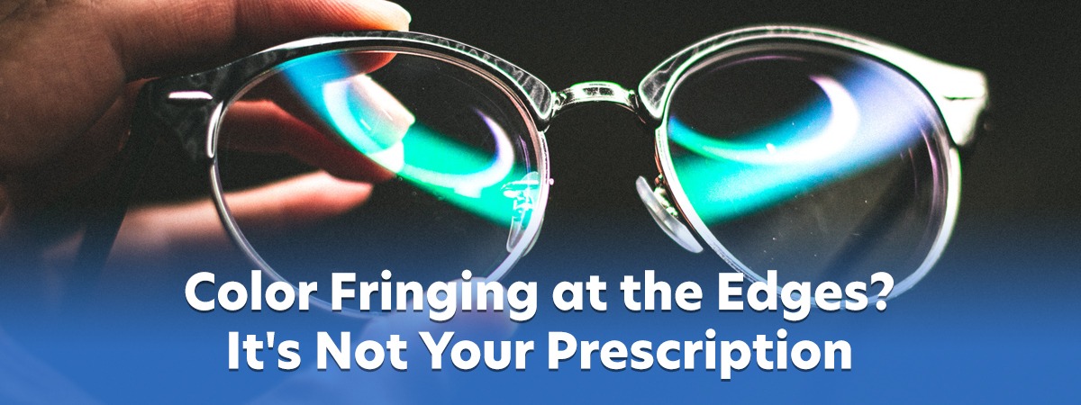
Your new progressives look great through the middle. Then you glance sideways to grab your coffee cup, and the edge of the cabinet door has a faint blue-orange halo (color-fringing).
Maybe you notice it at night. Headlights and streetlights smear instead of staying sharp. Maybe you tried the thin, light lens materials—polycarbonate, 1.67, 1.74—because they look better, and the world never felt quite crisp at the edges.
It’s not your prescription, and it’s not your eyes. It’s physics—a problem called chromatic aberration. And for decades, the industry’s answer was to tell you to live with it.
CamberPure™ progressives change that. They’re the lenses I wear and recommend to anyone who’d benefit from their design. Not because they’re new, but because this is the first progressive design that attacks the color-fringe problem directly instead of routing around it.
What Actually Happens Inside Your Lenses
Each color that makes up the light we see bends by a different amount as it passes through a lens material like glass, plastic, or polycarbonate. In a perfect world, they’d all focus directly on your retina. In reality, blue wavelengths focus slightly in front of it, and reds slightly behind.
Through the center of the lens, your brain corrects for the differences without you noticing. Through the periphery—where your eyes spend a great deal of time—that correction falls apart. You see color fringes on high-contrast edges, halos around bright objects, detail that looks hollow or smeared. Patients rarely call it chromatic aberration. Most describe it more simply: the glasses just don’t feel right.
Two versions of this matter, and one matters more to you
Longitudinal chromatic aberration (LCA) runs along the optical axis and produces subtle halos around high-contrast objects. It becomes more noticeable in prescriptions above roughly ±6.00D.
Transverse chromatic aberration (TCA) is the bigger offender for progressive wearers. It happens when you look away from the optical center, through the prism effect built into every progressive lens. Different wavelengths separate laterally across your retina, and you perceive that separation as colored borders along edges. The farther from the center you look, the worse it gets.
How visible it is depends on three things: your lens power, how far you look from the optical center, and the Abbe value of the lens material.
The Trade-Off You Were Never Told About
Every lens material has an “Abbe” value. A numeric measure of how much the material disperses (separates) the light. Higher is better.
- CR-39 (standard plastic): Abbe ~58, the least chromatic aberration
- Trivex: Abbe ~43 to 45, very good, high impact resistance, featherweight
- 1.60 mid-index: Abbe ~40 to 42, good balance
- Polycarbonate: Abbe ~30, high impact resistance, most color fringing
- 1.67 high-index: Abbe ~32, thinner, more fringing
- 1.74 ultra-thin: Abbe ~33, thinnest, more fringing
Here’s the catch that has cost patients clarity for decades. The materials most people want for practical reasons—polycarbonate for cost, 1.67 or 1.74 for cosmetics—are the ones with the weakest chromatic performance.
The industry’s answer has always been the same: pick one. Thin and light, or clear at the edges. Until now.
CamberPure Attacks It from Both Ends
CamberPure, built on the patented Camber blank, refuses that trade-off. It goes after the problem from two directions at once. IOT, a Spanish lens design house, designs the lens; Younger Optics, the world’s largest independent lens manufacturer, makes the Camber blank it’s built on.
First: The Foundation
Traditional progressive lenses begin with a single-vision blank that has just one curve on its front surface, chosen to suit the distance prescription. But a progressive’s power changes continuously from the fitting cross down to the reading area, and each power prefers a slightly different curve. One fixed curve doesn’t serve them all the same, so the progressive design software spends much of its math compensating for a foundation that’s wrong for most of the lens.
The Camber blank replaces that single curve with variable curves. The front surface gradually steepens from top to bottom, keeping pace with your increasing reading power. Distance gets the flatter curve called for, and the reading area gets the steeper curve it prefers. The design software can put its capacity into optimization rather than compensation.
Read also: https://goodrichoptical.com/why-the-blank-matters-camberpure-vs-compensated-pals/
Second: The Color-Fringing Problem
Here’s the part nobody else is doing. CamberPure’s Chromatic Aberration Reduction Technology (CART™, patent pending US 19/340,753) is built into the design itself. Rather than optimizing the lens for a single wavelength of light and accepting the rest, the design optimizes the back surface point by point across the visible spectrum, steering reds, yellows, and blues to the correct focal area. IOT describes it as compensating across thousands of peripheral points.
Published numbers claim an average 20 percent reduction in chromatic aberration across all lens materials, and an effective Abbe value above 40—even in polycarbonate and ultra-thin high-index.
In plain terms: edge performance comparable to thicker, lower-index plastic is now achieved in a thin, light CamberPure design.
What You’ll Actually Notice
Manufacturer claims are one thing. What matters is how your eyes do at 2 PM on a Tuesday, when you’re tired and your brain has stopped doing the extra work.
- Through the edges: colors look cleaner and edges hold their shape. Doors, signs, and text that used to carry a faint blue-orange border settle down. Detail recognition improves at distance, intermediate, and near. Wearers report enhanced color rendition, sharper definition, and depth perception that feels almost 3-D.
- High contrast: lights stay lights. Headlights, streetlights, and LED displays stop dragging trails behind them when you glance sideways.
- Initial adaptation: the design also uses Steady Methodology, exclusive to the IOT family of lenses, to minimize the peripheral distortion that slows progressive adaptation.
IOT, in association with the University of Madrid, ran a double-blind wearer trial: identical progressive design, one finished on a Camber blank and one processed from a standard single-vision blank. 100 percent of wearers reported near vision easier to find in the Camber version, with a wider-feeling reading zone, and appreciable magnification in the near field.
Over a full day: less visual fatigue, especially during long stretches of near work and screen time. Your brain stops working overtime to correct the color-fringing it’s been quietly fixing since you put the glasses on.
Who Gains the Most
CamberPure isn’t necessary for everyone. The benefit scales with the size of the problem.
If you wear progressives and want the best visual performance available, this is worth a conversation. If your prescription is stronger—say ±2.00D or more—the effect grows. If your prescription includes prescribed prism, or if you elect to use high-index for thickness, weight, or safety, you’re exactly the wearer this design was built for. If you already notice color-fringing or halos along the edges, you’ll feel the difference quickly. And if you spend long hours on screens or doing close work, reduced fatigue adds up.
One more thing worth knowing. CamberPure is available in all common lens materials, and comes in clear, UV420, photochromic, and polarized options.
From My Dispensing Table
First, no lens design fixes everything. Fit, measurements, and frame choice can matter as much as lens technology. A great design on poorly measured glasses is still a poor result. Accurate position of wear values change how the design performs, which is why we measure them rather than estimate.
Second, physics doesn’t negotiate. Minkwitz’s theorem still applies to every progressive lens, so the trade-off between corridor width and peripheral distortion exists in every design.
CamberPure pushes closer to those geometric limits. It doesn’t erase them.
Why CamberPure?
CamberPure is our go-to for two reasons.
First, it’s the only design we’ve found that addresses the chromatic problem directly: not just the edge blur, and not just for the wider, undistorted reading area, but the actual color-splitting that makes lenses feel softer in the periphery than they should.
Second, it’s who we are. At Goodrich Optical, a therapeutic optometrist and eye care clinic in Lansing, MI, you trust our knowledge and experience to guide you toward your best possible vision. That trust means we educate, we explain, and we weigh what your eyes, your work, and your life actually demand—not just sell you a pair of glasses.
A go-to should be the best answer to that weighing, not the easiest. This one is.
We could fit any progressive brand. There are several legitimate products with strong technology behind them. We choose the one that solves the problems nobody else touches.
The trade-off you’ve been living with—thin or clear at the edges—just became manageable.
If you’re considering new progressives, or you were steered away from polycarbonate or high-index because of color fringing complaints, this is a conversation worth having.
See the difference in the center and at the edge.
Your eyes deserve expert care. Schedule your exam at Goodrich Optical today.